
CHAMPAGNE BRUNO PAILLARD : A REJUVENATION OF HIS TIME
Description
To honour 40 years of independence and quality, the Bruno Paillard champagne house entrusted Partisan du Sens with the rejuvenation of its corporate visual identity and bottle labels.
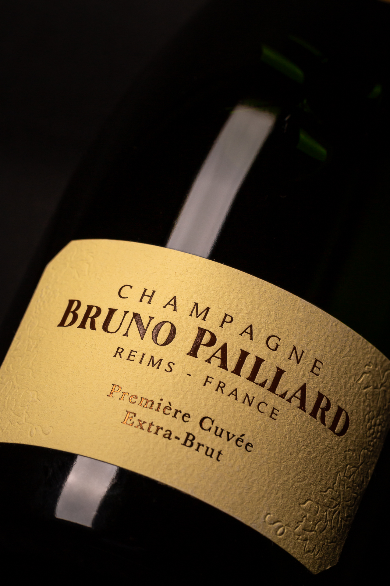
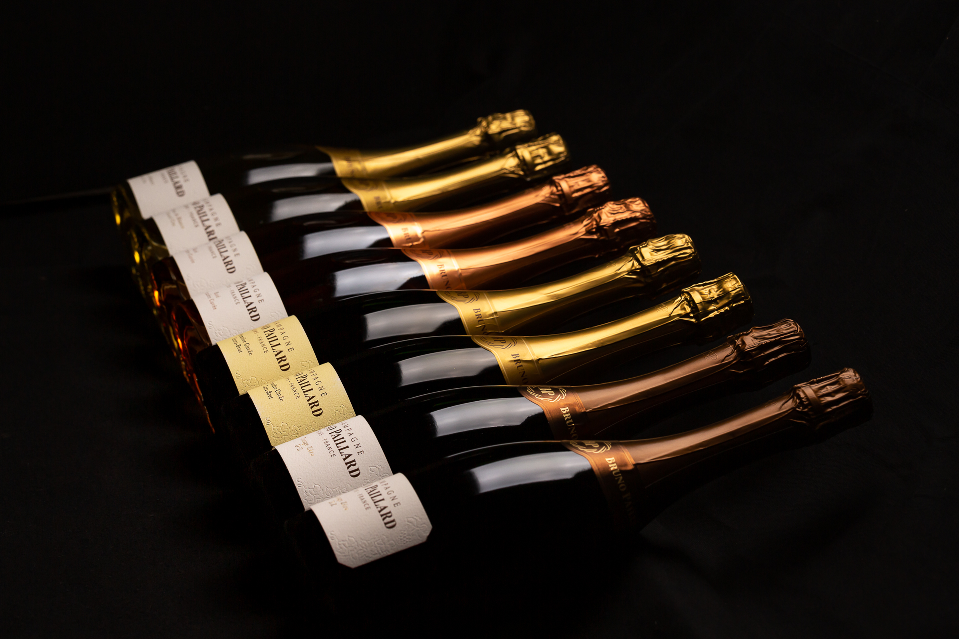
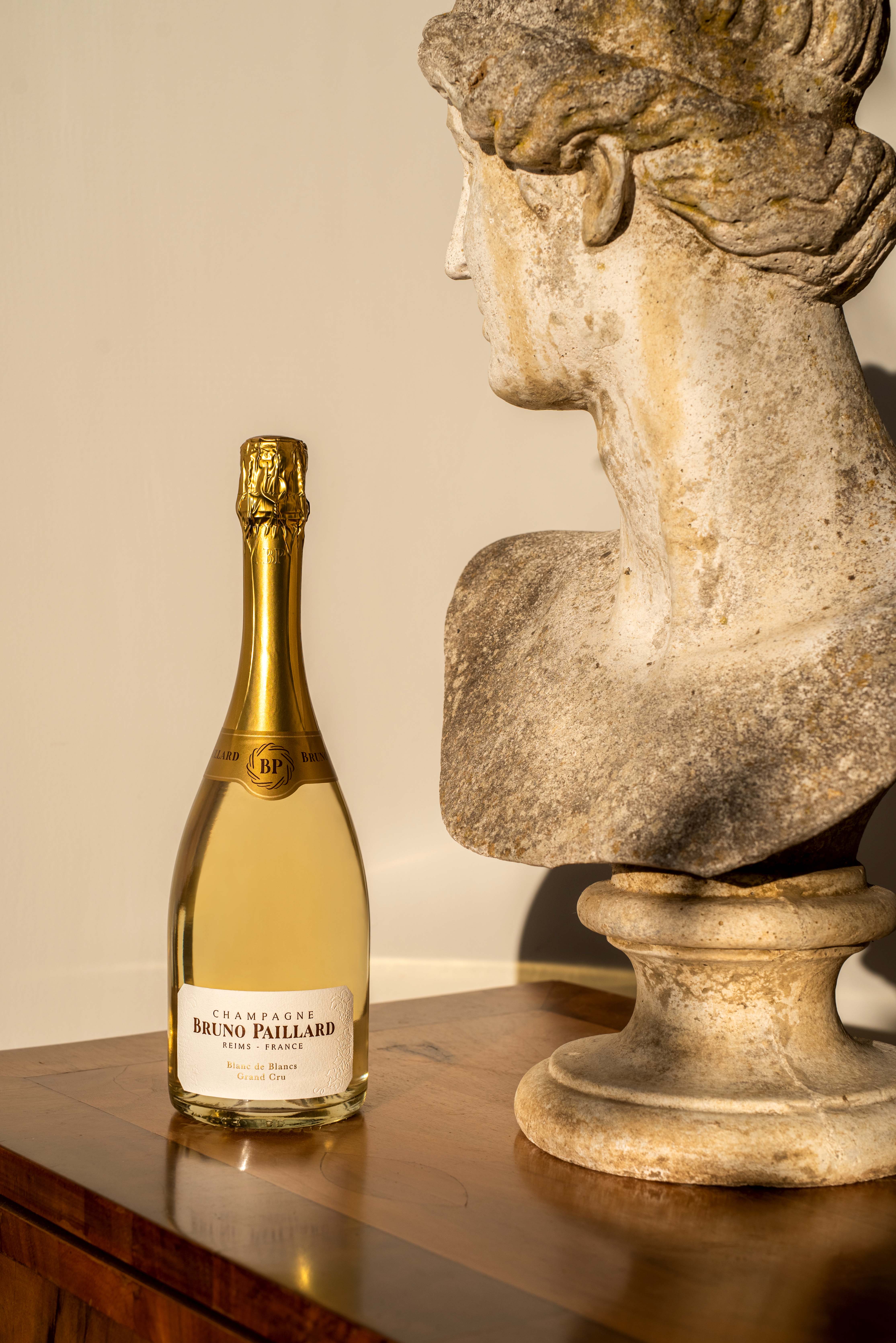
The rejuvenation work reflects the evolution of the house since its creation, in line with the times, and the house wanted to work with sobriety on all of its codes: a refined and streamlined brand block for greater legibility and visibility, accompanied by a new emblem for the house: the BP weave, an inspiration full of meaning, at the confluence of the notions of terroir, family ties and openness to the world today.
Like a return to the essentials, the new packaging highlights the founding elements of the house: the embossed vines, the chalky texture of the paper, the long cap with the new symbol of the house at its centre, the beveled labels, the iconic colour of Première Cuvée... all of which are enhanced by a graphic purity, echoing the purity of the wine.
With this creation, the house is asserting an image in phase with its evolution: modern, dynamic, timeless and singular.
Clients
BRUNO PAILLARD